My blog has moved!

You will be automatically redirected to the new address. If that does not occur, visit
http://marycimo.tumblr.com
and update your bookmarks.

Saturday, June 27, 2009

Why I Don't Recommend Lowe's for Paint Color Matching

I'm a notoriously impulsive painter for my own projects. I get in the mood to paint and off I go. It's been a while, but that's exactly what happened on Thursday night. I moved into a new home in February and had yet to choose my own colors. My friends *love* giving me a hard time about my ivory walls. I'd been eyeing Bunglehouse Blue by Sherwin Williams for my fireplace and media niche. I thought it would be a fantastic complement to my ruby red couch and oak floors.

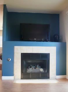
I often work with Sherwin Williams colors because they have great oversized color samples, in addition to beautiful color selections. The most important reason I recommend their colors? The paint color is exactly like the samples, so what you see is what you get. You'd think I'd follow my own advice. Sherwin Williams was closed, so I headed over to Lowe's. In every color consultation, I tell clients to go to a paint storeto have the colors mixed because they are professionals and do the best job. I've even had new clients come to me to redo their colors because they didn't get good results from a box hardware store. I figured that I would be the exception. I got home and excitedly opened up the paint can to get to work. I thought it looked a little dark. I was sure that once it was applied and dried, it would be the right color. I was wrong! The beautiful blue I expected came out as a blackish green. This morning, I headed over to Sherwin Williams to start over again. Wouldn't you know it, my new paint looked exactly like the sample. I LOVE it.

I thought about people who get many gallons of paint for a large project. I'm lucky it was just a fireplace. So much time and energy and money spent on colors that just aren't right. It doesn't have to be that way. Lesson learned. Go with the professionals for the best results and for the colors you love.

To schedule a color consultation, call 702.202.7543.
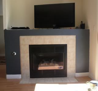


Wrong Color Fireplace
Photobucket

Thursday, June 25, 2009

Choosing Colors for Your New Home

I recently received a call from a new client. She and her husband had purchased a new home, and they were ready to paint. She told me that they had vibrant colors in their last home and wanted something different for the new home. She was frustrated because they kept gravitating towards the colors they had before, therefore they needed help.

When I arrived at their home for the color consultation, I saw pops of bright colors in their furniture, accessories and artwork. Right away I knew. They keep going back to these kinds of colors because they really like them! Typically, we feel the struggle in choosing colors when we're going against our intuition. Does that mean we're stuck with the same colors forever? Of course not. We chose a color palette that used cleaner hues with more of a punch. By combining citrus-y oranges and yellows and greens with a splash of aqua and java as accents, we created a unique and inspiring palette for their new home. Some of the colors were similar, but the home felt entirely different and their own.

To schedule a color consultation, call 702.202.7543.
PhotobucketPhotobucketPhotobucketPhotobucketPhotobucket

Tuesday, June 9, 2009

Medical Office Colors - Do They Matter?

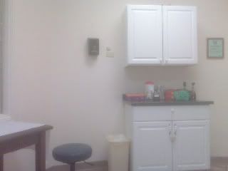
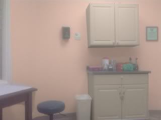
Recently, my daughter and I were patiently waiting in the examining room at the doctor's office. Stark. That's the only word I can come up with to describe it. Most of the time we spend in medical offices is spent waiting. Many times, we are apprehensive and uncertain about being there. Poor design contributes to this experience. On the other hand, a few simple changes to the examining room colors would make patients feel more comfortable and nurtured during their visit. Good healthcare design offers a balance of warm and cool colors. 

Which examining room would make you feel better?

Photobucket

Photobucket

Wednesday, June 3, 2009

The Many Colors of Starbucks


In a color consultation, I spend time getting to know my clients and their color associations. It plays an important part in determining what color families feel good to them. Every once in a while, Starbucks comes up. "I love the colors in Starbucks!" It's an interesting observation because unlike some stores, the colors in Starbucks are not the same from location to location. So it's not necessarily the particular colors, it's how they are used and how they make you feel. I'll ask my client what it is about the colors that they like. Words like "warm", "welcoming", "cozy", and "comfortable" come up. These feelings all have different color associations depending on your experience. These are the clues for me in creating a color palette for your home that feels this way to you. And might I say, Starbucks knows exactly what they are doing. They purposely create an environment where people want to get together and spend time. Think about it. Isn't that exactly how we want our homes to feel? Whether it's Thanksgiving dinner or movie night or a shared cup of coffee at the kitchen table. The right colors will make your home the place where your family and friends love to spend time.

To schedule a consultation or discuss your project, call 702.202.7543.