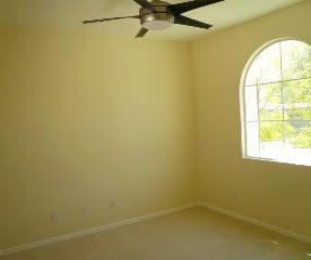
What advice do real estate agents give home sellers? Declutter and paint the home a neutral color to appeal to the most buyers. By neutral colors, they usually mean white, cream, or beige. Now by reading a bit about me, you know I'm not so enamored of white for most cases. Beige? It can work in combination with nice accent colors. I'm going to go out on a limb and tell you not to put your home on the market with neutral colors--especially if it's empty. No color appeals to everyone, but that holds true for neutral colors as well. A fresh coat of paint will make the home look clean and fresh. Using the right colors will make it feel alive and inviting.
Did you notice that most model homes these days aren't using neutrals? A lot of marketing research goes into home sales by builders. The point of a model home is for you to buy it. Are model homes neutral and boring? Absolutely not. They have character and personality. A home down the street from me just sold in 2 weeks in this tough market. While it was priced right, it had been painted in soft pastels of blues, greens, and yellows. It was evocative of a craftsman home feel with the wood floors throughout. Obviously, color didn't scare the buyers away.
Color is a great option when you don't have the budget to remodel. By choosing the right colors, you can enhance the look of kitchen cabinets and countertops. You can also de-emphasize or add interest to a boring white tile bathroom. Paint and new faucets are a great way to make a bathroom more up-to-date. Take the photo of the bathrrom above. It's very typical of the glamour bathrooms you see in homes built here in the 80s and 90s. There is sea of white tile along with lovely black accent tile. Admittedly, it would have been better had they left out the stripes, but that's what we've got. So to this client (who actually has this house on the market right now) I would recommend that they use a soothing pale blue or green to give a calm, clean spa-like feel. Sure, the stripes are still there, but the eye will be drawn to the color. The way it is now, the black is all there is to notice.
Sure, not everyone will like the color you picked, but if it's done well and pulls the house together, potential buyers will be drawn in. They'll stop a bit and linger as they wander from room to room, like wandering through a garden. And remember, the longer a buyer stays, the better the chance they'll envision themselves making your house their home.
P.S.
Do you have a paint dilemma? Feel free to email me at maryfrances@mycolordesigner.com. I'd love to discuss your questions here for the benefit of you and the other readers.


