My blog has moved!

You will be automatically redirected to the new address. If that does not occur, visit
http://marycimo.tumblr.com
and update your bookmarks.

Monday, July 21, 2008

Mamma Mia! Blues


This weekend, I ventured out to see the Mamma Mia!, expecting great music and fun. What I didn’t expect was the breathtaking scenery in the movie. The film is set in Greece with the sunny Mediterranean as the perfect backdrop. As one scene melted into another, I realized how fantastic all of these beautiful blues would look in Las Vegas. True, we don’t have an abundance of water. But, we do have plenty of sunshine and plenty of Mediterranean architecture.


Wondering how to bring the feel of the islands to your home? Read on…


Photobucket


The Greek flag is emblazoned with azure blue and white. If you have a master bathroom with a lot of light, try this striking combination with an abundance of white tile. This contrasting deep blue hue will brighten the white. It’s a natural fit and reminiscent of the sea.


Photobucket


Looking to create a tranquil space in a bedroom? Try this chalky shade of blue for the walls and white sheers for the windows. It can take a room that radiates with desert sun and make it feel so much cooler.


Photobucket


Add a red and white area rug or bed cover to make it feel lively.


Photobucket


Use soft yellow or green accents to make it feel more peaceful. Red and blue oppose each other on the color wheel, so used together, they create movement. Yellow and green are closer to blue on the wheel so they harmonize together.


In creating a true Mediterranean look for your home exterior, go from off-white to bright white. With an orange or red tile roof, this is classic Greek style. Strong sunlight illuminates the white against the brilliant blue sky and green trees. It’s the perfect look and feel for our climate. Finish it off with rustic brown garage doors and an Aegean blue or olive green front door.
Look beyond the ordinary in Las Vegas design. Instead, look to the original architectural influences. They’ve been getting it right for thousands of years.


Monday, June 30, 2008

Selling a Home? To Paint or Not to Paint.


What advice do real estate agents give home sellers? Declutter and paint the home a neutral color to appeal to the most buyers. By neutral colors, they usually mean white, cream, or beige. Now by reading a bit about me, you know I'm not so enamored of white for most cases. Beige? It can work in combination with nice accent colors. I'm going to go out on a limb and tell you not to put your home on the market with neutral colors--especially if it's empty. No color appeals to everyone, but that holds true for neutral colors as well. A fresh coat of paint will make the home look clean and fresh. Using the right colors will make it feel alive and inviting.

Did you notice that most model homes these days aren't using neutrals? A lot of marketing research goes into home sales by builders. The point of a model home is for you to buy it. Are model homes neutral and boring? Absolutely not. They have character and personality. A home down the street from me just sold in 2 weeks in this tough market. While it was priced right, it had been painted in soft pastels of blues, greens, and yellows. It was evocative of a craftsman home feel with the wood floors throughout. Obviously, color didn't scare the buyers away.

Color is a great option when you don't have the budget to remodel. By choosing the right colors, you can enhance the look of kitchen cabinets and countertops. You can also de-emphasize or add interest to a boring white tile bathroom. Paint and new faucets are a great way to make a bathroom more up-to-date. Take the photo of the bathrrom above. It's very typical of the glamour bathrooms you see in homes built here in the 80s and 90s. There is sea of white tile along with lovely black accent tile. Admittedly, it would have been better had they left out the stripes, but that's what we've got. So to this client (who actually has this house on the market right now) I would recommend that they use a soothing pale blue or green to give a calm, clean spa-like feel. Sure, the stripes are still there, but the eye will be drawn to the color. The way it is now, the black is all there is to notice.

Sure, not everyone will like the color you picked, but if it's done well and pulls the house together, potential buyers will be drawn in. They'll stop a bit and linger as they wander from room to room, like wandering through a garden. And remember, the longer a buyer stays, the better the chance they'll envision themselves making your house their home.

P.S.
Do you have a paint dilemma? Feel free to email me at maryfrances@mycolordesigner.com. I'd love to discuss your questions here for the benefit of you and the other readers.

Monday, June 2, 2008

The Case Against White

Study Before

Study After


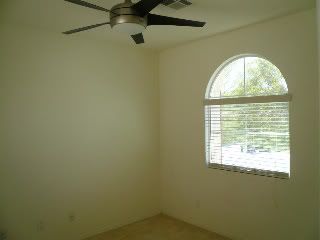
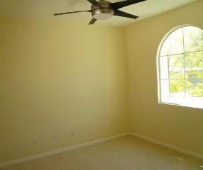
I'm a color designer, so obviously you'd think that I'd be biased against white paint. Personally, the only way I could have white walls is if I could have predominately colorful furniture and accessories. I once had the experience of a builder handing me the keys to check out a new home that had fallen through. I was on the verge of giving him a deposit on this almost-finished great deal of a home. I loved the model, adored it really. So when I walked in and saw the stark white walls, my heart sank. Where was the home I was so enamored of? Of course they do a fantastic job decorating model homes--that's what sells them. I realized that it wasn't the structure I loved, it was the feel of it. This was not my dream home afterall.

Why is white so complicated? It's simple. It coordinates with everything. It's not offensive. In most cases, it's not anything really. But put your typical furniture and accessories in an all white home, you'll find it lacking that special something. Ultimately, white can appear as gray because it reflects the shadows of the room. I have a great example of this from recent project I completed. By changing the color from white to burnished cream, the room warmed up and felt inviting. It's subtle but makes such a difference. Color doesn't have to be scary or bold or trendy. It can make the space exactly how you want it to feel. If you love white, go for it (I promise not to tease you about white being the favorite color of schizophrenics). All I ask is that you don't stick with white just because it's safe. Life's too short for you to live in a space you don't love.

Thursday, May 8, 2008

What's Wrong With This Picture?

If you've lived in the valley for a decade or more, you must be excited about the prospect of painting your home exterior something other than off-white. Navajo white was the color of choice for homebuilders in the 80s and 90s. It's a nice look with Spanish tile roofs, right? And what's good enough for southern California is good for Las Vegas. Times have certainly changed and southern Nevada is ready for color--any color but off-white. But, people are finding that it's not so easy to pick the right colors for the relentless desert sun. Take my photo example for instance. The picture does not even begin to show how bright this home is. They meant well, and it probably looked good when they picked the paint chips. Here's where exteriors can be tricky:

Contrast: They did a nice job wanting to accentuate the architectural features of the home. On the other hand, the color is much too strong, especially in contrast to the dominant color of the home. Subtle color on the garage doors would have been nice, too. The front door is where you can play with vibrant color if you wish.

Illumination: It seems that they wanted to warm and brighten the exterior of the home. The problem is that the main color is much too bright for the desert sun. The light is so intense here that it has a tendency to make warm colors look like they are on fire. Also, stucco has a shadowing effect, so paint appears darker on vertical, stuccoed walls.

If they would have gone with more subtle shades of these colors, it could have come out beautifully. The idea was good, it just needed to be finessed for the environment. It's imperative to test the colors during different times of the day to see what you're getting. I also suggest testing your final choices on the stucco to see if it's what you truly desire. One client called me in a panic because her first color choice (before consulting with me, of course) was a brown tone that looked purple when she tested it on the house. You can never really tell until you see it. When it's the exterior, there's no hiding it until the next time you paint. It pays to do your research to get the home you love.

Wednesday, April 23, 2008

VOCs and Me


Recently, there's been a lot of talk about going green, especially in design. In 1978, lead-based paint was banned in the US. Lead had been used because it improved the performance of the paint. Unfortunately, dangerous health hazards resulted. Now, the latest chatter is about VOCs, volatile organic compounds. Put simply, VOCs produce an inhalable gas when applied. This is especially true of paint. The scent of fresh paint is probably as recognizable as the scent of freshly-baked chocolate chip cookies. The physical effects of VOCs are still being investigated, but there is no doubt that the VOCs in paint affect air quality.

It's not as exciting as choosing color, but it's helpful to know the current research to make an educated decision about paint. According to the EPA, the levels of organic pollutants is 2-5 times higher indoors than outdoors. Here is what the EPA has to say about the health effect of VOCs:

The ability of organic chemicals to cause health effects varies greatly from those that are highly toxic, to those with no known health effect. As with other pollutants, the extent and nature of the health effect will depend on many factors including level of exposure and length of time exposed. Eye and respiratory tract irritation, headaches, dizziness, visual disorders, and memory impairment are among the immediate symptoms that some people have experienced soon after exposure to some organics. At present, not much is known about what health effects occur from the levels of organics usually found in homes. Many organic compounds are known to cause cancer in animals; some are suspected of causing, or are known to cause, cancer in humans.


No matter what type of paint you choose, make sure you the affected area is well-ventilated. Also make sure that any leftover paint is not stored in the home.

What does this mean to you when you're planning a paint project? You should definitely consider low-VOC or no-VOC paint if anyone in your family or workplace suffers from chemical sensitivities or respiratory illness. Low-VOC has significantly less off-gassing than traditional paint. You can also choose no-VOC paint that is VOC free and odor free. I strongly recommend this choice if you are painting a school, office, children's room, or playroom.

Ultimately, you have a choice. Feel free to get in touch if you'd like to know more. Paint reps are more than happy to help you get the information you need.

Saturday, April 19, 2008

Colors That Work - Retail Space

Jos A BankB
Photobucket
Barnes & Noble Awnings


I started off by complaining about the monotony of building exteriors in suburban Las Vegas. While grocery shopping this morning, I noticed a retail shopping center that did color just right. The key to color harmony is mixing the right shades of warm and cool. Notice that they didn't use tan, but contrasting warm and pale orange tones. For cool accents, they used teals, greens, and white. In addition, they architectural features are highlighted beautifully. It's visually interesting, and each storefront is differentiated from one another. A job well done by Crossroads Common Center at Charleston & Fort Apache.

Friday, April 18, 2008

Welcome to Colorful Las Vegas?

I'm a Color Designer living in Las Vegas. Why on earth would someone need help selecting paint colors when there are so many neutrals to choose from? It's the desert--use desert colors. I don't have a problem with neutrals, I swear. I'm all for structures blending with the surrounding environment. That makes sense. But, there's something happening here that must be stopped. Look at the picture above. The landscape is a picture of harmony. Thousands upon thousands undifferentiated homes sprawling across the Las Vegas valley. Visually, it's impossible to tell where you are in Las Vegas without a GPS. Virtually all of the homes built during the construction boom here look the same--not only the exterior colors, but the interior as well.

I'm not proposing a revolution, just a break from the monotony. A home doesn't have to look like a circus tent or boutique hotel to be interesting. All I'm saying is that color is life. With the right shades of color, your home can become your haven. Your home can be a reflection of you and how you want to feel in your space. There may be restrictions by your homeowner's association about how you can express yourself. Don't let that limit you in the space where you live. Armed with the principles of color harmony, you no longer have to be afraid.